From “scary sci-fi tech” → to human, safe, and trustworthy
Client: Neuralink
Industry: Healph | High-tech
Skills: Brand Strategy | Visual Identity
Growing into a more human future
Neuralink has long been seen as bold but distant, futuristic tech with a cold edge. Today, its mission is shifting closer to people: helping patients, building trust, and opening new possibilities for everyone.
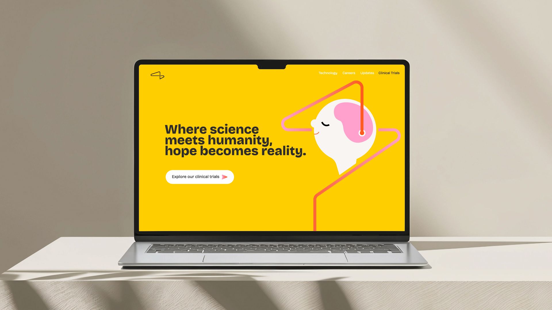
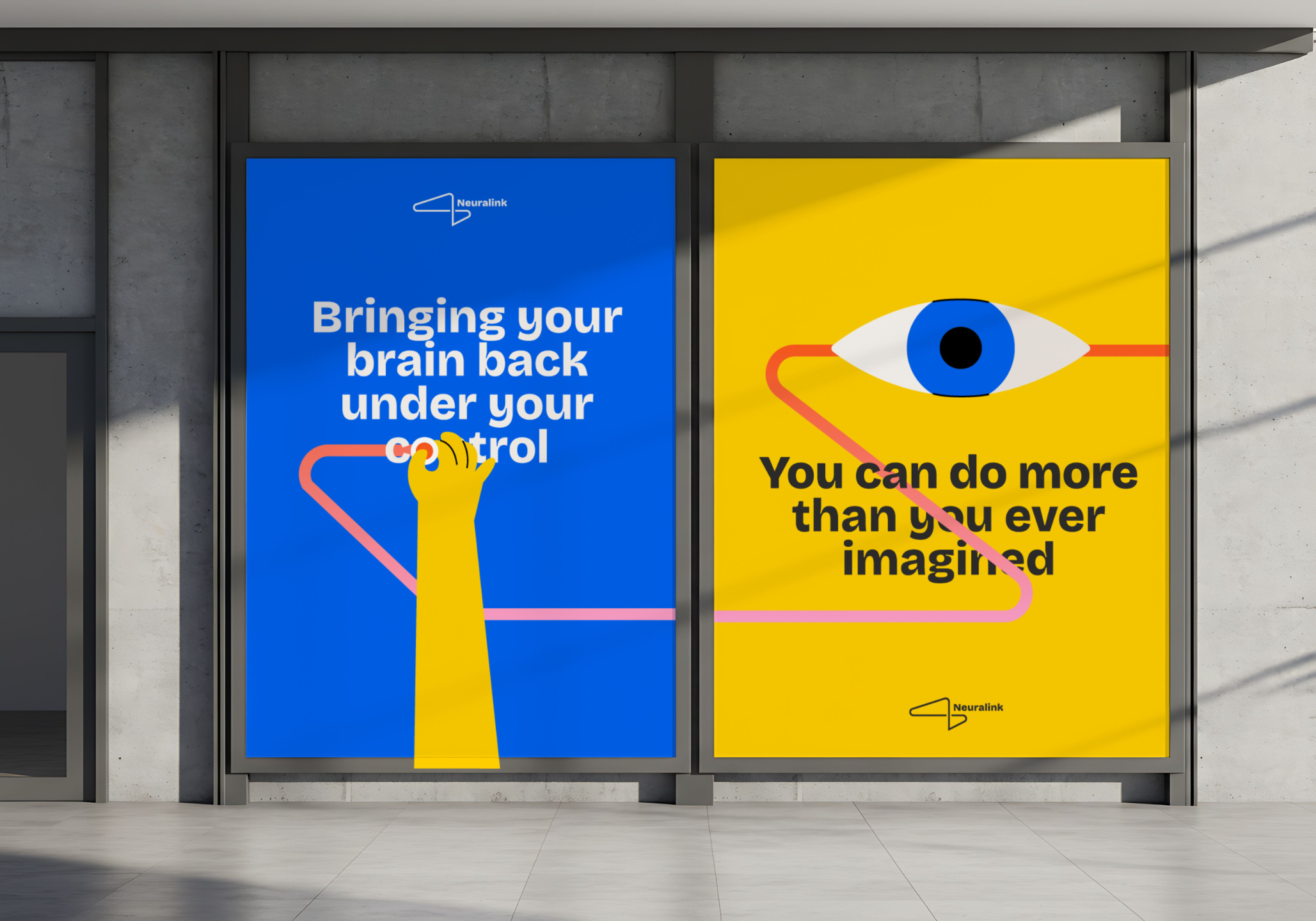
The new brand identity reflects this change with warmer visuals, balanced design, and a more approachable tone. Neuralink is no longer just a pioneer in brain-computer tech, it’s a company shaping a safer, more human future.

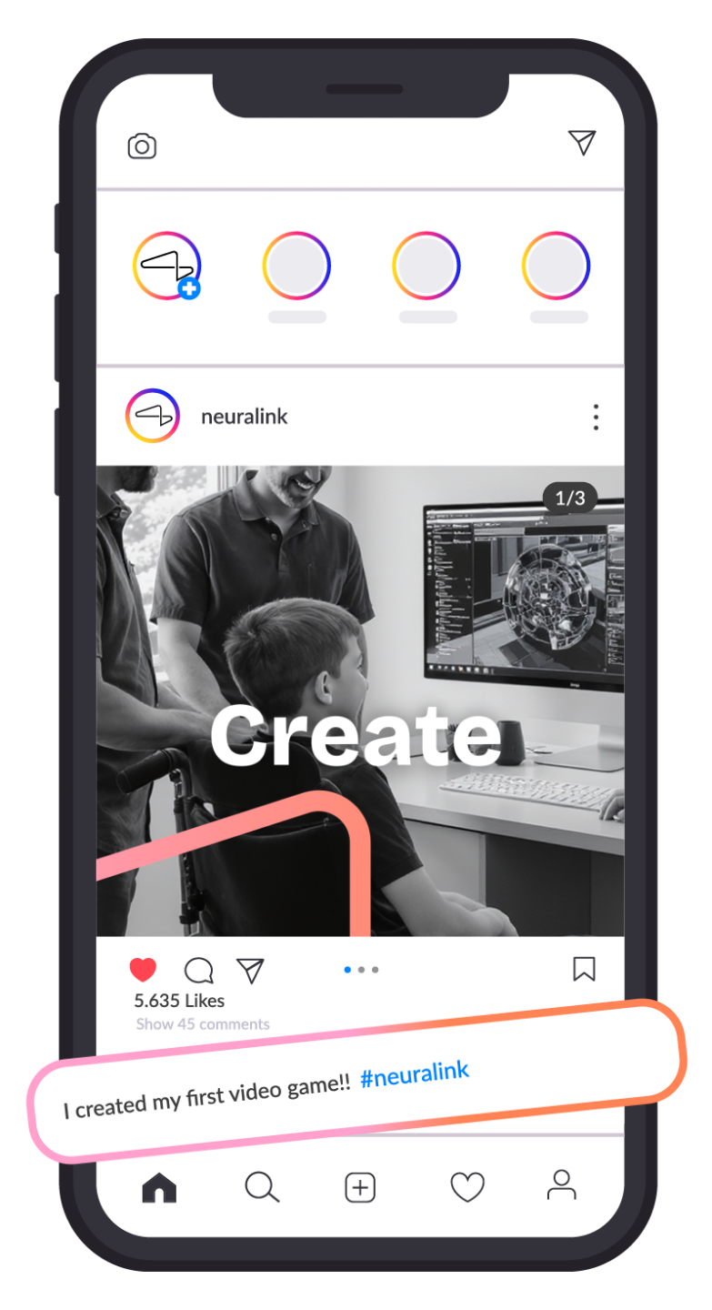

Our new design shows a warmer, human side of Neuralink.
Bright colors, friendly shapes, and clear messaging make the technology feel approachable, safe, and full of hope.
Old Logo
Took up too much space and felt heavy. The sharp shapes and misalignment created a cold, unbalanced look. Excessive spacing in the wordmark made it feel disconnected. Overall impression: distant, technical, and slightly unpleasant.
New Logo
Uses a warm sans-serif font that feels more approachable. Shapes are more balanced and rounded, reducing visual tension. Cleaner alignment and spacing improve readability. Overall impression: safe, modern, and human-centered.
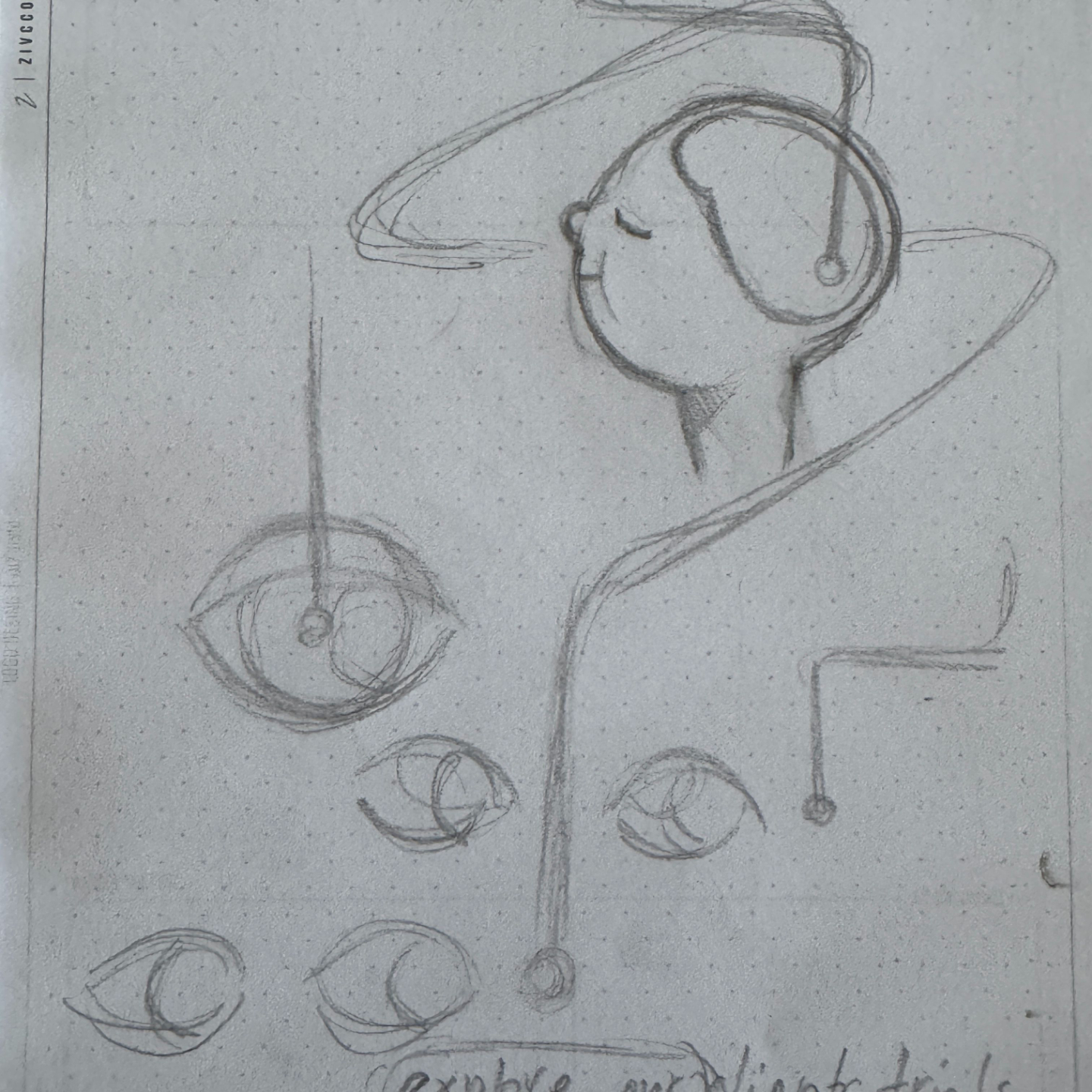
Visual Research
In this rebranding, I explored how Neuralink could shift from a cold, structured, B2B-style identity toward a warmer, more human look. My goal was to create a B2C-friendly style that feels approachable, safe, and emotionally engaging rather than distant and clinical. The full process and insights are documented in my Neuralink Rebranding Research